Data Deep Dive: Google Trends, Part II
Google search data is widely accessible, but few understand how to use it correctly or the rigor required to ensure its reliability. We continue the deep dive inside.
Welcome to the Data Score newsletter, composed by DataChorus LLC. The newsletter is your go-to source for insights into the world of data-driven decision-making. Whether you're an insight seeker, a unique data company, a software-as-a-service provider, or an investor, this newsletter is for you. I'm Jason DeRise, a seasoned expert in the field of data-driven insights. As one of the first 10 members of UBS Evidence Lab, I was at the forefront of pioneering new ways to generate actionable insights from alternative data. Before that, I successfully built a sell-side equity research franchise based on proprietary data and non-consensus insights. After moving on from UBS Evidence Lab, I’ve remained active in the intersection of data, technology, and financial insights. Through my extensive experience as a purchaser and creator of data, I have gained a unique perspective, which I am sharing through the newsletter.
This article continues the data deep dive covered in Part 1. After covering the common questions addressed with the data and going deep into the underlying data, we continued the deep dive format. There’s much more to consider beyond the underlying data related to cleansing and enriching the search data.
Google Trends is often used as an alternative data1 source. But I get frustrated when I see Google Trends misused to support arguments. The data itself isn’t flawed; rather, it’s the misunderstanding of the data that leads to misinterpretation and poor application.
Sponsored Advertisement
Exabel published their latest US Consumer Sector Report as of July 2024, which includes data from Facteus, Flywheel Alternative Data, Revelio and newly added Apptopia, Datos, and Placer.ai. The combination of transaction data, web-scraped pricing and demand data, clickstream data, foot traffic data, and app usage data provides multiple angles on the health of the US consumer sector, covering 80+ companies. You can sign up using the link below to receive monthly updates. https://www.exabel.com/us-consumer-sector-report/
The use case for discussion was sparked by a well-known YouTuber in the music industry, who recently used Google Trends to argue that music is not as good as it used to be and that music is becoming less popular. I thought this question of the popularity of music compared to other activities provided a great low-key topic to explore via Google Trends, using the best practices for getting quality results. It also helps contrast good and poor uses of Google Trends. Check out Part 1 for more context.
In the Dataset Deep Dive Series, the format covers the following topics:
Common questions addressed with the data (Covered in Part I)
Underlying Data (Covered in Part I)
Cleaning the Data (Part II)
Enriching the data (Part III)
Limitations to consider (Part III)
Action items to begin using the data (Part III)
In the original publication of Part I, I planned on completing the deep dive in Part II. But the level of detail needed to cover data cleansing required its own dedicated deep dive. I’ve decided to leave the data enrichment, limitations and action items to begin using Google Trends data to Part III.
Part II is going to go very deep into the rigor needed to cleanse the raw data to enable trusted insights powered by Google Trends data. While very specific to Google Trends, it is important to note that high-quality alternative data sets of any type go through this type of deep work because most alternative datasets are are very messy in their raw state. Like Google Trends, the data is typically pivoted from its primary use case to address investment questions, which means it is not a perfect fit for use right out of the box. Understanding the details and techniques to clean raw alternative data is not only important for understanding the integrity of the data but also for having a deeper understanding of appropriate use cases.

Cleaning the Data
Working with the random sample returned by the query
Many users are unaware that Google Trends provides only a sample of the data with each search. This means that two people entering the same term might receive slightly different results. The data should be similar, but for less popular search terms or when the target variable requires more precision, the sample may not be good enough.
I believe Google provides a sample of the data to protect the value of its search analytics available behind the paywall. This data is intended to be used to help businesses drive web traffic to their sites by selling data to optimize ad word selection.
How can we extract more than one sample of each term? We effectively need to clear the cache and this can be done by searching for something that has no real searches in the real world combined with the actual search term we care about. Adding a random string to your search term will produce slightly different results, helping to capture variations in the sample data. For example, below is the term music, so you can see that music as well as two other searches for music plus a random text string give similar but different results. For example, the 3 “different” searches resulted in a ~10% difference between the high and low values for the week of February 18th–February 24th, 2024. If a potential 10% difference in raw data values, caused by getting just one version of the random sample, would cause too much noise for your output analytics, you will need to extract multiple versions of the same term. To use the multiple samples, average them together to get a single summary of the search activity, which will be closer to the underlying search data.
Keep in mind that this will happen when you refresh the analysis. History will change for the same data points (ignoring for a moment that if a new max value is returned in the time series, the index will be rebased to the new 100, restating all data points).
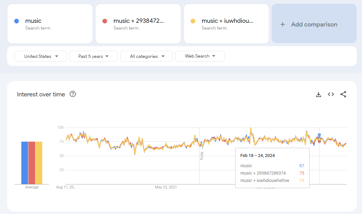
In your extraction process, use a random number generator to come up with additional terms to add to your target search term and create multiple variants in order to extract multiple samples of the target term. It depends on how limited you would allow the volatility in the numbers as to how many variants to enter to be able to result in a stable time series close to the actual underlying search numbers and not the random sample.
Working with the constraint of 5 searches per extraction
For every query of Google Trends, the tool looks at underlying data, extracts a sample of the data for the term, and then indexes the data to the maximum value set at 100. So, whenever you pull two completely different sets of terms, they are uncomparable to each other.
To explain the concept, let’s look at the terms music and hip-hop separately and then together.
Here’s the search term result for “music”:
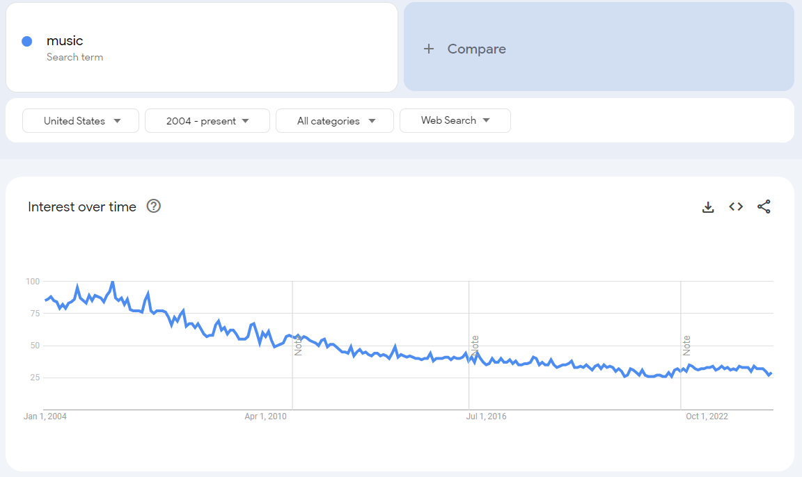
And here are the search results for the search for “hip-hop music” using the predefined, black-box tagging done by Google.
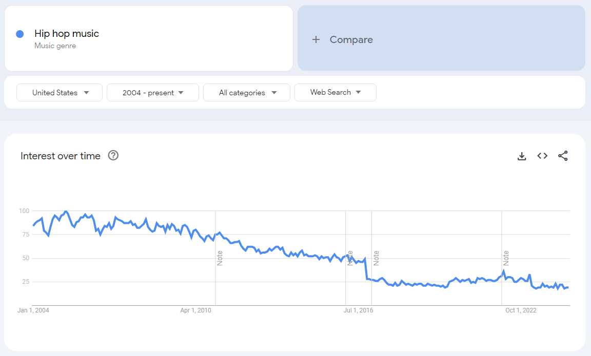
However, if you put both on the same chart, you get the relative size of each term to each other. What you see in the chart below is that the values for the Hip Hop Music search have been rebased to lower values, indexed to the maximum returned value for the combined query, which is based on searches for "music.” It’s important to know that the underlying data is the same in both charts for “Hip-Hop Music.”
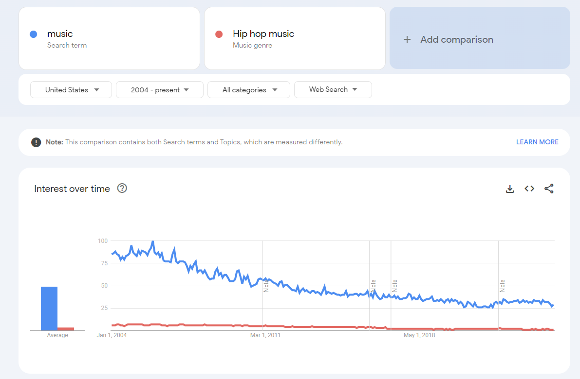
The ratio between search terms reflects the underlying data and remains consistent when sampling is controlled correctly, regardless of the specific terms used in the queries.
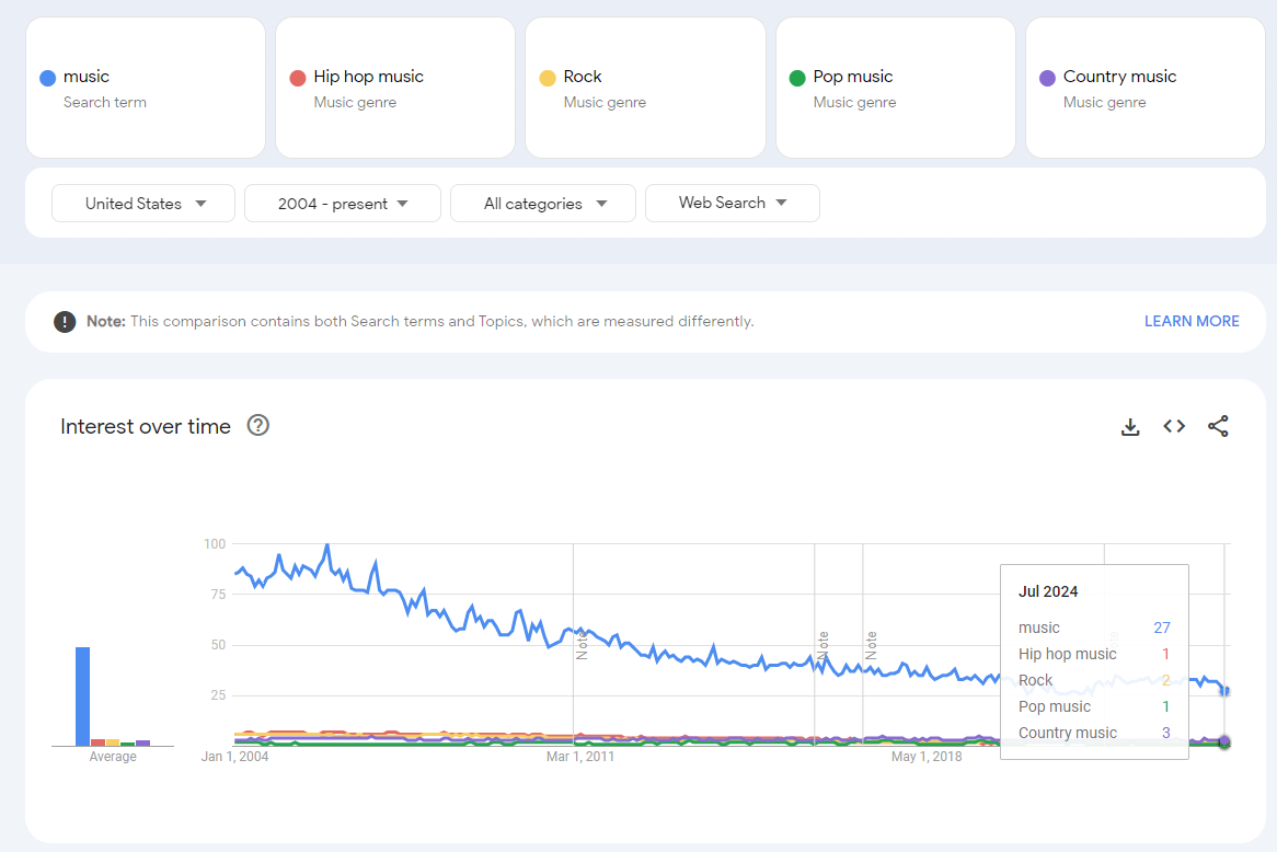
I’ll prove this with two new queries that use the maximum five search terms per query allowed by Google Trends. However, in each query, I will keep one constant term: "music.”
Query 1: Music, Hip-Hop music, Rock, Pop Music, Country Music
Query 2: Music, Techno, Punk Rock, Blues, Jazz
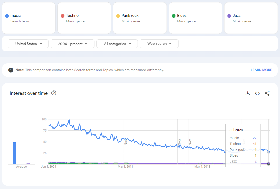
I used the prebuilt search terms for sake of simplicity, but you can see in the two images that the value for “music” stayed the same between the two queries at 27. This means the values are comparable between the two queries since both queries are indexed to the same maximum value of 100 for “music.”
However, what would happen if the the search query had a different maximum value?
Let’s pull another set of terms. In Part 1, we discussed how Rick Beato compared the popularity of music to social media and video games.
Lets use some of the terms Rick Beato compared in his video like social media, Art, video games, etc. But for the sake of the exercise, let’s add one more term, which is going to change the maximum value returned, which will cause the data to be reindexed to that maximum value. I leveraged the most popular search terms in August 2024 provided by Google to select an extremely popular term that is going to change the scale. You’ll see the #4 most searched term on Google is Google. Yes, people search for “Google” on Google.
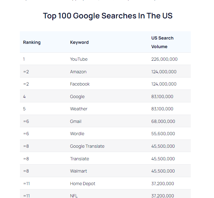
Including “Google” in the search query will likely return a much higher peak search activity than in previous queries, where “music” had the highest activity, indexed at 100 in December 2005.
Query 3: Music, Social Media, Art, Video Game, Google
Peak searches for “Google” on Google were in September 2014. So, that means the music search no longer has the maximum value of the chart shown as 100. In this chart, the search activity for music is 10 in July 2024. In the prior charts, where “music” had the maximum search values, the query returned 27 as the value for July 2024 (query 1 and query 2).
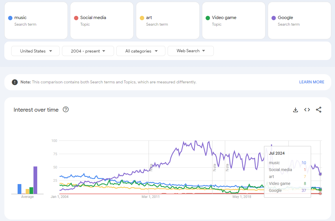
Despite the different index values, the underlying data remains the same. By using the ratio of “music” values between the two charts, you can “stitch together” data across different queries, overcoming the 5-search limit.
We can use the value for “music” in both queries to adjust the “video games” search value, aligning it with the data from the query that included “music,” “hip-hop,” “rock,” “pop,” and “country” music in Query 1.
If we use the 27 value as the base and we want to make the video game search value of 8 comparable to the music search value of 27 (instead of two separate charts), its just 8 x 27 / 10 = ~22.
We can check that math easily. Let’s drop Google from the search in query 3 to create query 4.
Query 4: Music, Social Media, Art, Video Game
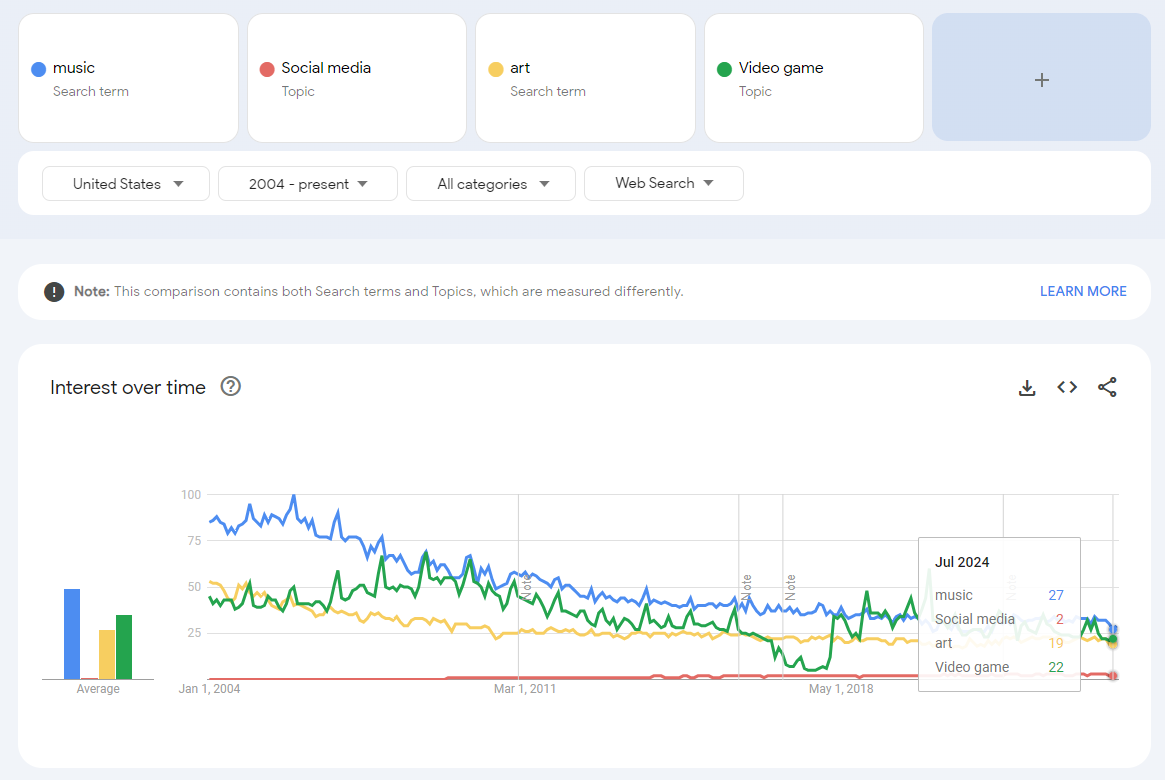
You can see below the “music” search value of 27, which is the same as seen in queries 1 and 2.
And in this query, you can see the “video game” search value is 22, just like we calculated.
What makes a good control term?
We need to use this principle to stitch together multiple queries by using a control term. In the example above, “music” would not be a good control term.
A good control term should not be a target term in your analysis but rather a neutral term that remains stable over time
The control term should be centrally positioned among all search terms.
If the control is too small, it can cause significant volatility in the ratios (e.g., control values of 0, 1, and 2 can lead to highly unstable ratios).
Also, think about control terms that hover around 100; it would mean the target terms may see rounded values of 0, 1, and 2, which would lead to very large % changes in the target terms, overstating the materiality of the changes.
The control search term chosen should be consistent across all geographies of the analysis and not introduce data volatility when transposing the numbers to the same scale.
Working with multiple time periods and granularity
Depending on the analysis, you may need more frequent data points and a long-term series.
The historic time period selected changes the frequency of the data available to be downloaded. For example, looking at the past 90 days will give you daily data, but looking at the full history will give you monthly data.
Daily data for the last 90 days:
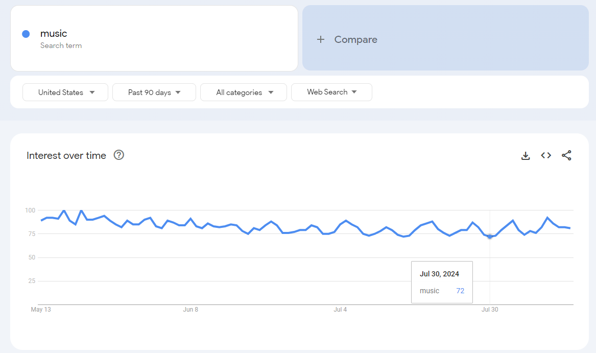
Daily data for the prior year over the same time period:
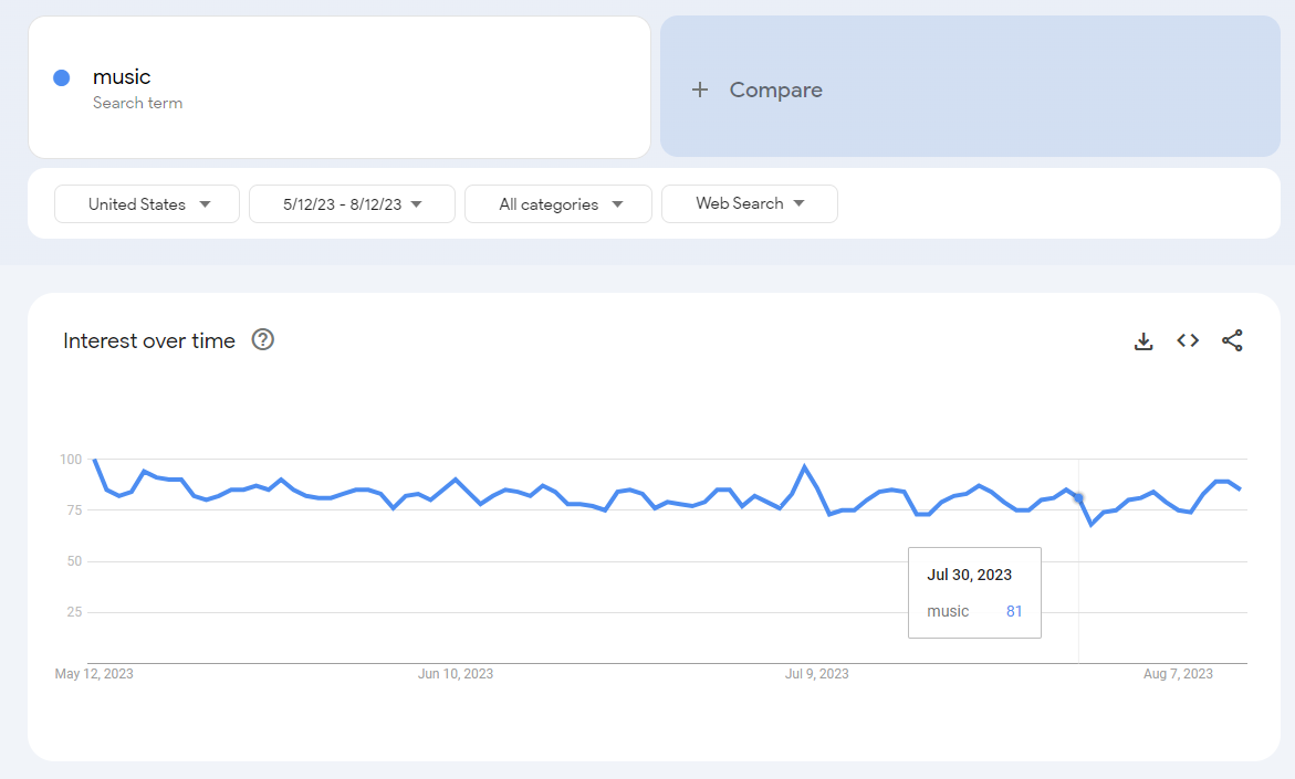
Again, these are the same underlying data as the long-term series:
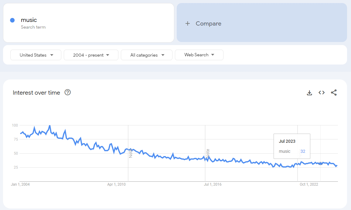
So the ratios between the daily period and the long-term monthly period should be consistent. This approach allows you to align daily values from 90-day windows with long-term trends based on monthly or weekly averages, providing a more cohesive historical analysis.
Dealing with “<1” and dealing with restatements
After collecting the data for the control terms across the relevant geographies, including multiple versions including random text strings to extract more of the underlying data beyond the sample, there will still need to be an effort to clean up the data.
How to handle search queries that return values of 0 or "<1”
Google Trends returns whole numbers between 0 and 100. If a search term is significantly more popular than another, the less popular term may be indexed so low that it shows as “<1”.
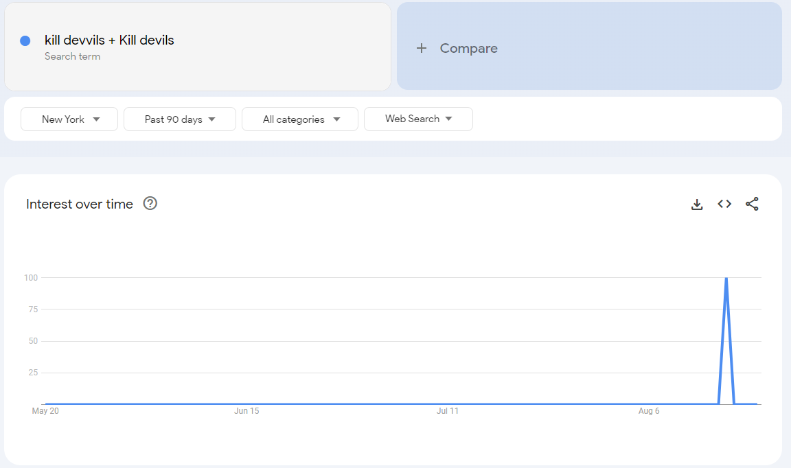
For example, here’s the search activity for the Brooklyn-based Indie Pop-Rock band that I play bass in (called “Kill Devvils”). Search activity in the New York City metro area “spiked” to 100 for our recent show in Times Square on August 16th.
However, that 100 becomes “<1” when we add Taylor Swift to the search activity. That “<1” means there is search activity and not actually 0.
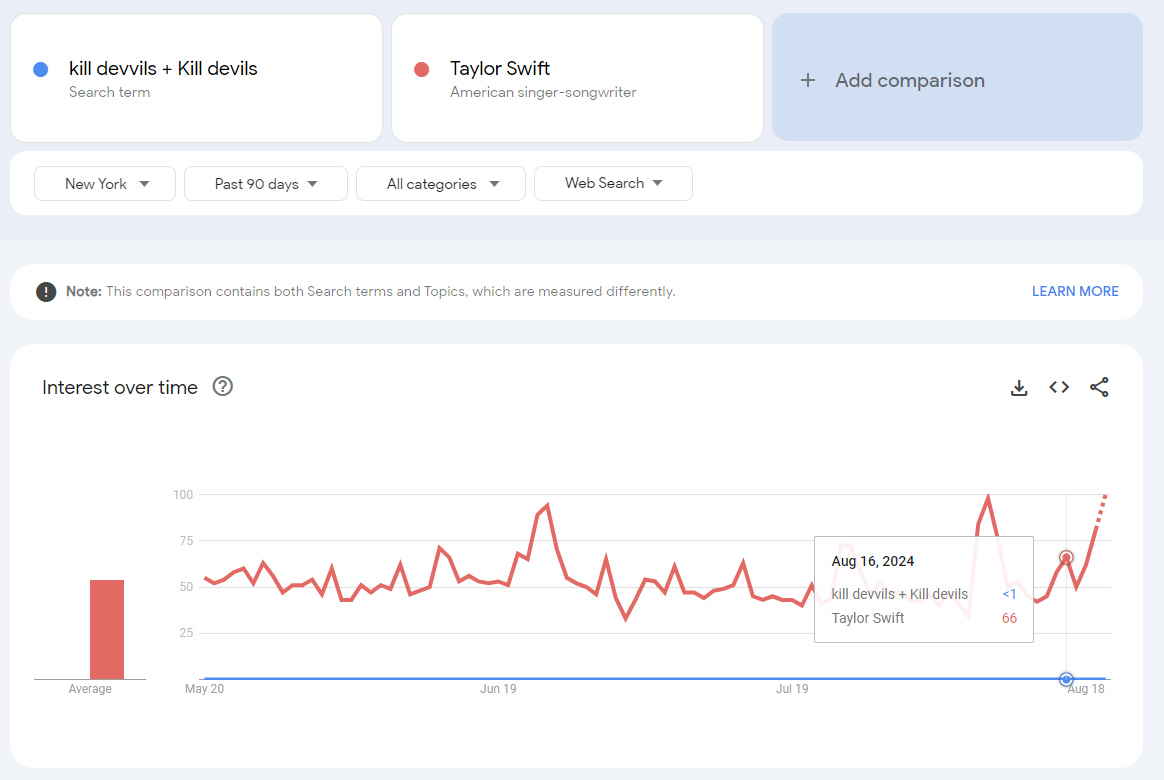
The next day, search activity returned to 0. No one searched for our band the day after our show.
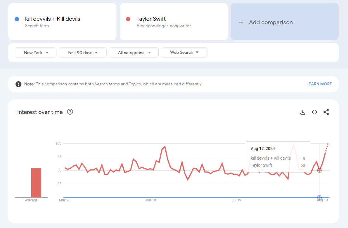
Anyway, when this happens in the search data, try to regroup the search terms with similarly popular searches in order to return values with a relevant range for analytics. However, if the search term is very small compared to the control term, you will need to pick a different control term.
If the search activity remains shown as “<1” despite comparing it to less popular terms, we can be comfortable replacing the value with 0. For example, searches for Talyor Swift are infinitely more popular than searches for Kill Devvils, even on the day when friends and family of our band members searched for the details of our show (and not only 66x more if we chose to round “<1” up to 1 instead of down to 0).
Sometimes Google Trends will return a time series with relevant values but randomly, the series will include a value near 0 for one or a few data points. The Google Trends tool can have errors returning values. Sometimes it makes sense to wait and try again later. If waiting isn’t an option (you’re stakeholders need an answer "yesterday"), it’s better to treat these inconsistent data points as nulls rather than forcing them to 0.
Numbers will constantly be restated—point-in-time stamp is needed
Google Trends data is not static; the returned values can change over time due to updates in the underlying model used to generate the data. When selecting the full history available, you’ll see notes on the chart annotating model changes (past changes included changes in data collection and geographic tagging). These updates may be applied retroactively, altering historical data.
In addition, over time, search terms that are the target of the analysis may continue to grow each month, leading to new maximum values in the most recent period. This will restate the historic data, as it is now indexed to a new maximum value. Eventually, some of the oldest data points will begin to approach very low values, causing the metric built on top of the data to change due to the rounding to whole numbers.
To track changes over time, it’s crucial to include point-in-time stamps2 in your analytics, allowing you to compare “as is” versus “as was” data.
In theory, one could attempt to hold the history constant and restate the new data to be on the same scale as the prior data points, but because Google may restate its entire historic output from a stated point in history, it makes managing all the transformations more of a headache than it’s worth.
Furthermore, sometimes the behavior of the search terms changes due to user behavior changing. Search behavior does change over time as a reflection of the changes in how people find information and also changes as the information people need changes. It’s better to rip the bandaid off and recreate the crafted search term used for the entire history instead of trying to stitch together the old search term and new term, which is also theoretically possible, but I would argue is not worth the effort.
Let’s apply the Google Trends principles we’ve discussed by replicating the data extraction that Rick Beato demonstrated on his YouTube channel:
Here are the search terms Rick Beato showed individually in his YouTube video that leveraged Google Trends: https://youtu.be/TU96wCDHGKM?si=F1e8zXQw_yxhe_cQ&t=185
Music
Pop Music
Hip Hop
Country Music
Art
Video Games
Social Media
Instead of using worldwide geography, I’ll just use the US (see Part I as to why). These terms don’t fully align with the actual search behaviors on Google due to the presence of homonyms and the general nature of terms like 'music.' To ensure more accurate results, we’ll use predefined searches (see Part I for a discussion on this).
I downloaded the data into Excel and combined it using the cleansing techniques discussed earlier, allowing us to work beyond the 5-search term limit.
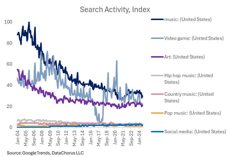
The data still shows “music” searches falling, as Rick mentioned in the video.
However, his search term “social media,” while growing rapidly, is nowhere near as popular as searches for the music category.
In addition, video games are equally as popular as music, though lower than earlier in the time series.
Searches for “art,” in the context of searches for “music,” have held up relatively well compared to “music” searches, considering the chart shows the gap narrowing relative to music. I would note that searches for “art” are currently at a lower level than at the start of the time series (like Rick Beato mentioned in his video).
Concerns about the data quality related to search term design
However, I have concerns about the pre-built search terms. It’s worth noting a suspicious drop in the video game topic around 2017, followed by a recovery—highlighting one of the risks of relying on prebuilt terms.
The prebuilt search terms are not covering all searches for the categories and the results are not following logically intuitive behavior.
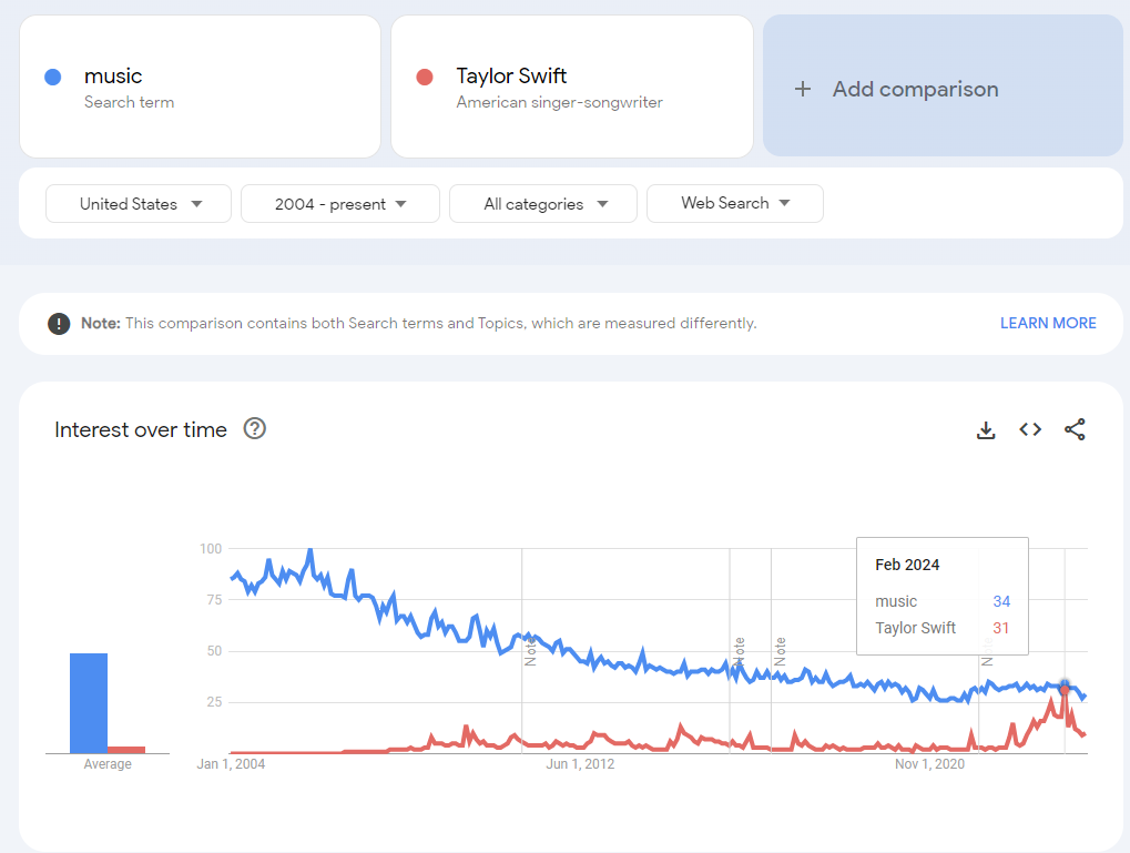
For example, there are more searches for music than Taylor Swift, though Taylor Swift searches did get close in February 2024 (and remember, searches for Taylor Swift are independent of searches for “music” unless the search term used was “Taylor Swift Music,” so the search for just music is understated vs. all types of music searches).
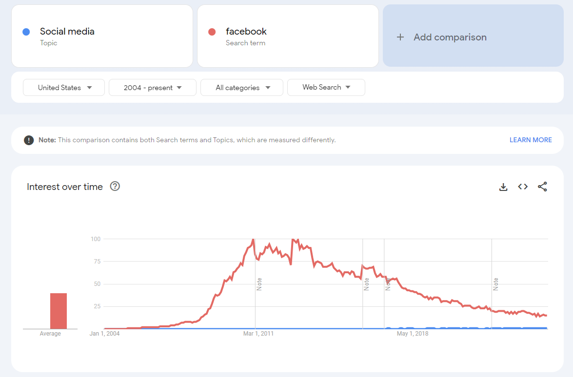
Here’s a more extreme example. Intuitively, we would expect searches for “Social Media” as a prebuilt term by Google to include searches for the leading social media platforms. However, it doesn’t. The magnitude of Google searches for “Facebook” causes the pre-built “social media” topic searches to show up as “<1” or 1 for the entire series. If searches for “Facebook” were included in the prebuilt search term, then “social media” would reflect the combined searches for Facebook and the other platforms.
To improve accuracy, I would create a comprehensive list of search terms, selecting the most popular artists in each music category for every year of the analysis. I would apply the same approach to video games and social media platforms. Though the popular artists and social media sites would change each year, in aggregate, the most popular would act as a proxy for the overall search.
For example, people don’t search for the term “social media.” In 2004, they searched for Facebook and MySpace (and maybe some holdouts for AOL Instant Messenger?). In 2024, they search for Facebook, Instagram, and TikTok. To do the analysis for the musicians, it would require a very large set of terms to reflect the fragmented market.
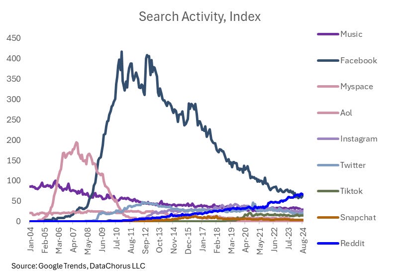
In the below chart, I created search terms for a selection of social media platforms to compare to searches for “music.” What Rick Beato was proposing was that social media was becoming more popular than music. We can test that by replicating the searches for the popular platforms over the years. To do this, we would need to use a control term to stitch the data together to go beyond more than 5 terms. We would need to extract more than just a single sample of data. Here’s how it turned out (I followed all the steps in Part I and Part II of this deep dive to create the chart below):
One thing to note is that in the process of making the data comparable, it is possible that the values will go beyond 100. In the case above, the music search in the charts above reached 100. But in a separate group of terms pulled, Facebook was the 100 in the chart and Music was ~15 in the chart, so the multiplier effect to get Facebook on the same basis as the original music search caused the score to be 7x the value of music, breaking the max 100 scale.
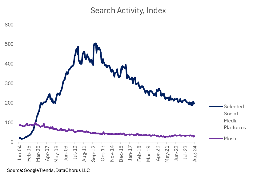
We can add the values of the different platforms together to create a new combined index of popular social media platforms, reflecting what was intended by the “social media” search term. Searches for social media on Google did grow rapidly two decades ago, passing searches for “music” early in Google Trends’ 20-year history of data. It too has seen declining searches in more recent periods.
Is using Google Trends data the right way to prove Rick Beato’s point? No.
So on this basis, the intuition that social media was being searched for more than searches for music is correct. However, the question to be answered in the debate proposed by Rick Beato was actually about the popularity of music versus other activities. Google Trends is top-of-mind awareness. That’s a different question than the popularity of a topic.
Effectively, consumer search behavior changed in relation to the popularity of music: people aren’t searching for music on desktops. Streaming data across music genres would offer a more accurate measure of music’s popularity trends over time.
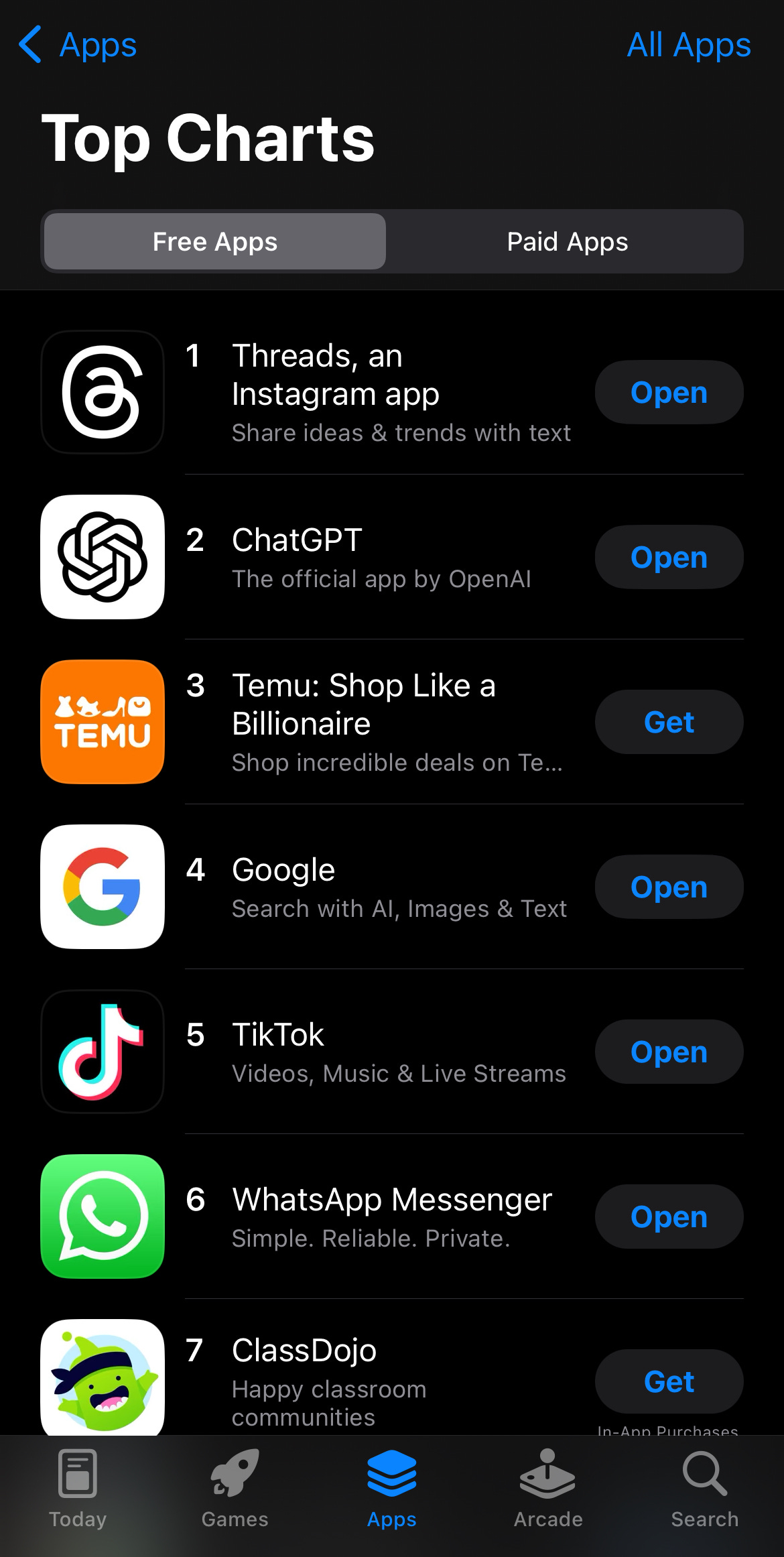
Let’s also consider the social media use case. Consumer behavior has also changed here over the last 20 years. Despite high search activity for Facebook, TikTok’s search trends appear stagnant—yet it ranks as the #5 app in the iOS App Store, above Facebook (as of August 12th). This suggests that search trends alone aren’t appropriate to capture the top-of-mind awareness of social media platforms: app downloads and usage metrics may be better indicators. Younger generations don’t need to Google the term “TikTok” to find the app and download it.
It’s crucial to remember that Google Trends reflects top-of-mind awareness and is not a comprehensive indicator of behavior. In addition, not all actions start with a Google search, so other data sources are often necessary to capture the full picture.
Why I used this example to deep dive into Google Trends:
My goal with this example was to provide a low-risk, non-investment approach to demonstrate how to effectively use Google Trends for data analysis.
I wanted to pick a topic relevant for readers of the Data Score without turning the article into a full investment thesis (this isn’t investment research). I also want to avoid writing about anything that would be useful in my day job. So this topic was a low-risk way to show how to think about Google Trends data collection while also showing some ways it gets misinterpreted.
Stay tuned for Part III:
In the Dataset Deep Dive Series, the format covers the following topics:
Common questions addressed with the data (Covered in Part I)
Underlying Data (Covered in Part I)
Cleaning the Data (Part II)
Enriching the data (Part III)
Limitations to consider (Part III)
Action items to begin using the data (Part III)
In the original publication of Part I, I planned on completing the deep dive in Part II. But the level of detail needed to cover data cleansing required its own dedicated deep dive. I’ve decided to leave the data enrichment, limitations and action items to begin using Google Trends data to Part III.
In Part III, I’ll focus less on technical details and more on how the popularity of searches can be used to demonstrate practical applications of Google Trends while sticking to the overall theme of music searches. The approach should inspire ideas for applying Google Trends to other relevant and critical investment debates.
While you wait for Part III, explore these past data deep dives to learn how to transform raw alternative data into actionable insights.
- Jason DeRise, CFA
Alternative data: Alternative data refers to data that is not traditional or conventional in the context of the finance and investing industries. Traditional data often includes factors like share prices, a company's earnings, valuation ratios, and other widely available financial data. Alternative data can include anything from transaction data, social media data, web traffic data, web-mined data, satellite images, and more. This data is typically unstructured and requires more advanced data engineering and science skills to generate insights.
Point in time-stamped history: This phrase refers to a dataset that provides the time data to show how data has been revised. So it includes not only the time period the data was related to but also the date when the entire data set was originally released or revised. This allows investors to use the data in back-testing models as if it were seen in real time before revisions.


